|
This is an extra credit plate set thrown in porcelain. Each plate has the same radius all the way around the plate, but overall there are three different radii between the plates. I glazed each plate the same way to create unity in the projects, seeing as they would match and be unified. Three hearts take the middle of the plate and green and black dots line the edges, half of the plate in green and half the plate in black. To create these designs, I used detail glazes (which went over a coat of clear glaze). To make sure these plates stood off of the table except for at the base, I made sure to pull up and out, not just out as I previously had (which led to most of the plate touching the tables). Not only do these plates have unity, but they also have emphasis and color, seeing as the details are emphasized due to the color differences. Overall, I get a joyful, festive feeling from these plates. 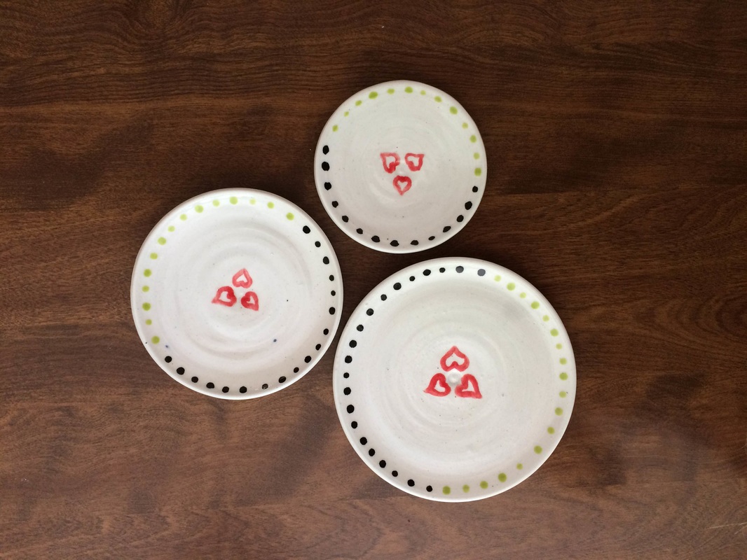
0 Comments
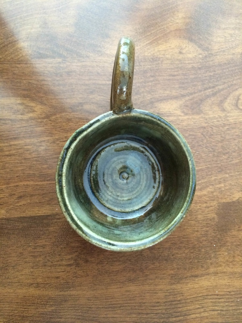
This is an extra credit vase thrown in vashon white. The radius is fairly equal 7/8 of the way up the project. In the last eighth of the project, it drastically shrinks and then flares to create the neck and lip of the vase. In the side of the vase is carved a series of alternating hearts and two's. I glazed the inside in black scrap, the outside in turquoise matte, the hearts in detail red, and the two's in detail black. I had to learn how to choke in such a way that I could drastically change the radius of the vase without destroying it while I was throwing, which was to slowly, but with lots of pressure, choke the project. This vase has contrast and texture, as the calmness of the green and the brightness of the red contrast and the turquoise matte is not evenly spread, allowing the texture to change between rough and smooth. With these characteristics, the vase gives off a feeling that reminds me of a candy shop or hand-made goods store. 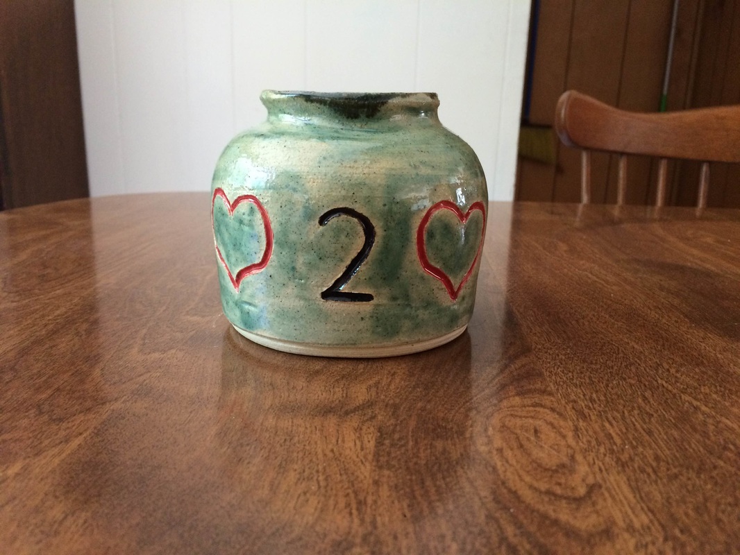 This is an extra credit wheel-altered bowl. The project starts with a narrow base and then begins to flare out like a bowl, ending in a series of "waves" at the top. I had dipped it in dark blue, dripped translucent sea down the sides (which is difficult to see in the photos), and painted the name "Stena" on the inside base with detail black (also hard to see in the photo) as this is for one of my friends named Stena. In order to fabricate this project, I learned how to alter a wheel-thrown project off of the wheel after it has been thrown so as to add shape and flare to it in a way that I am not able to on the wheel. This bowl has a deep-sea feeling to it, which comes from the color and movement present as it makes it seem like it could be part of the deep, deep sea. 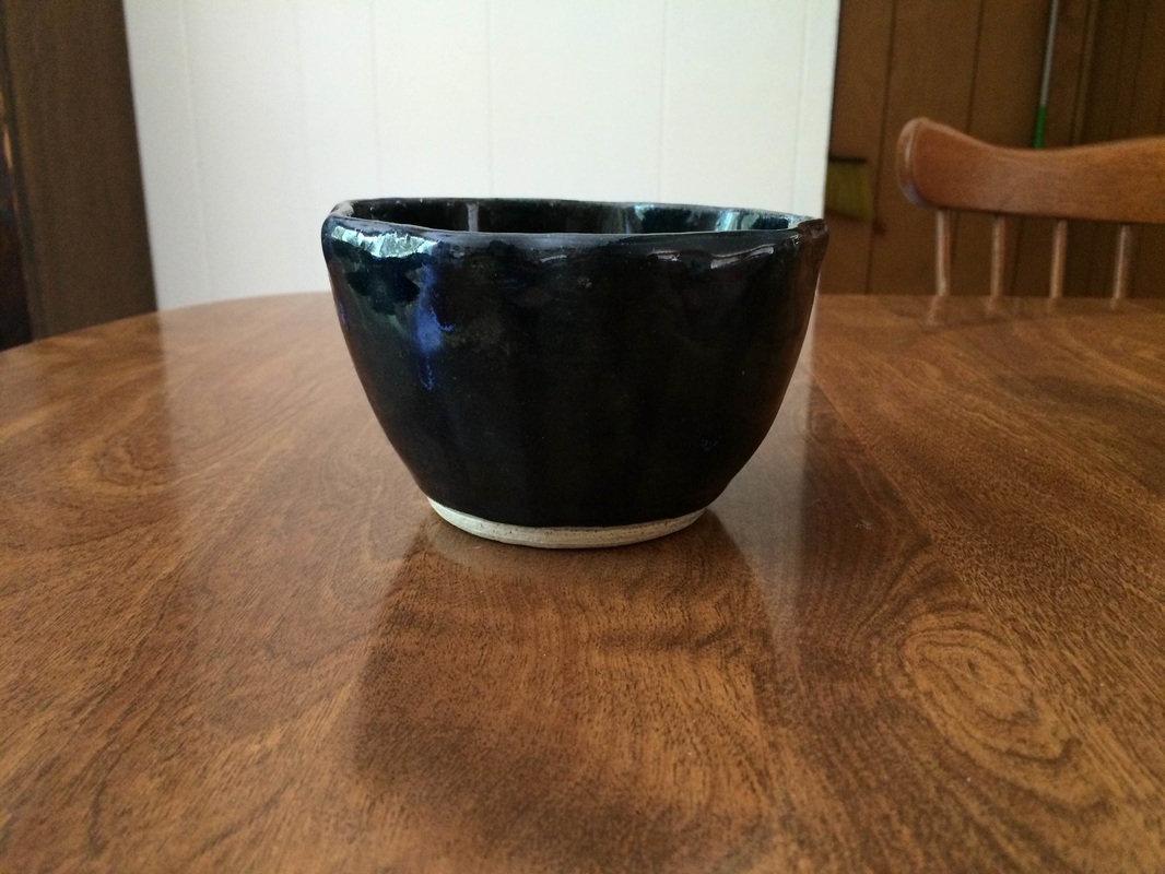 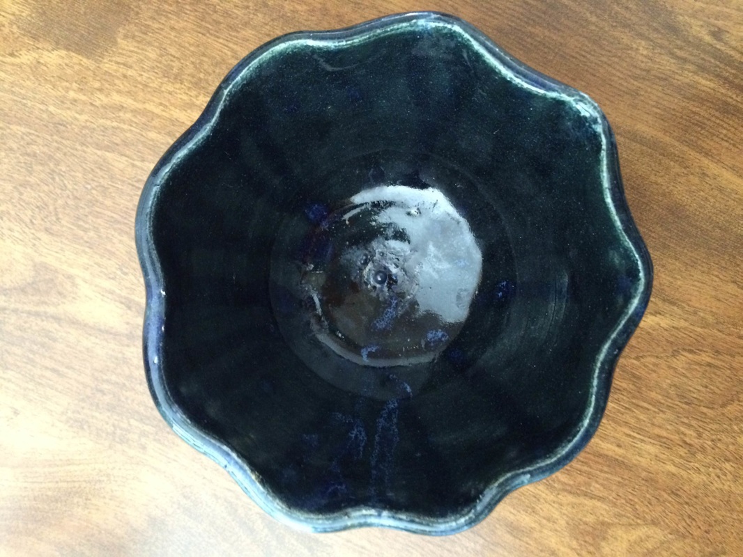 This is an extra credit mini cup. Overall it is proportional in size, even the handle which is quite small. The sides have triangles carved into it, and the handle has little "holes." I glazed it in sand and then used the detail red, orange, and yellow glazes to decorate the handle and the triangles. For this project to be created, I used a new skill of pulling a wide base and then pulling the walls up at a 90 degree angle to make the most space in the cup. Color, due to the detail glazes, and emphasis, due to the contrast between the bright red and mellow sand glazes, are present in this project, helping give off an Egyptian-like feel. 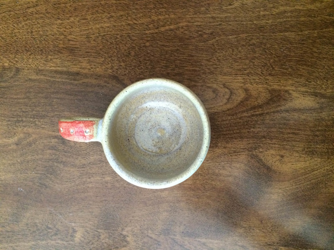 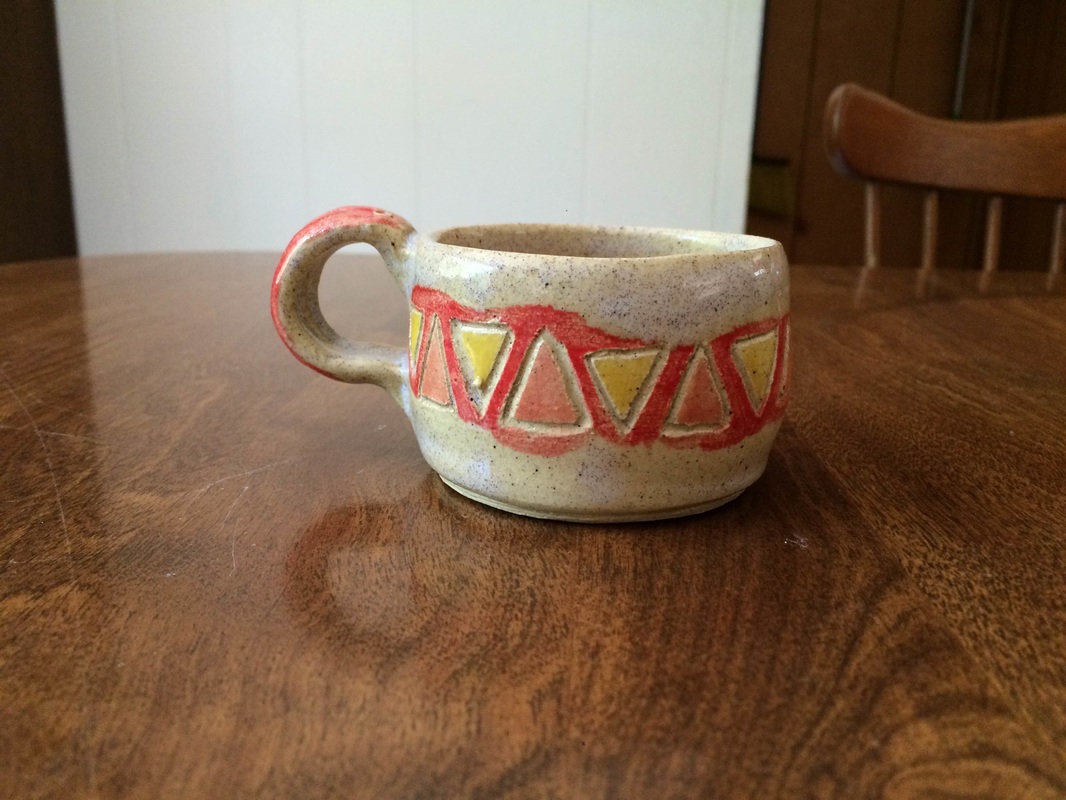
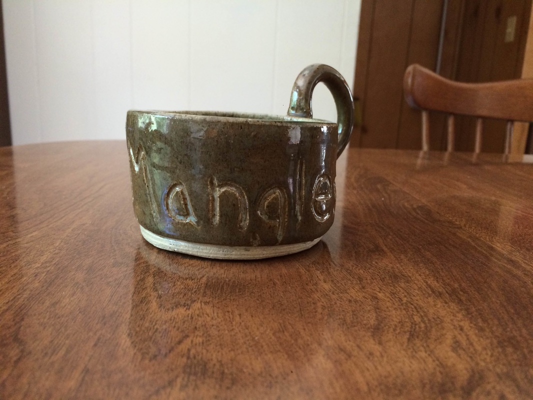 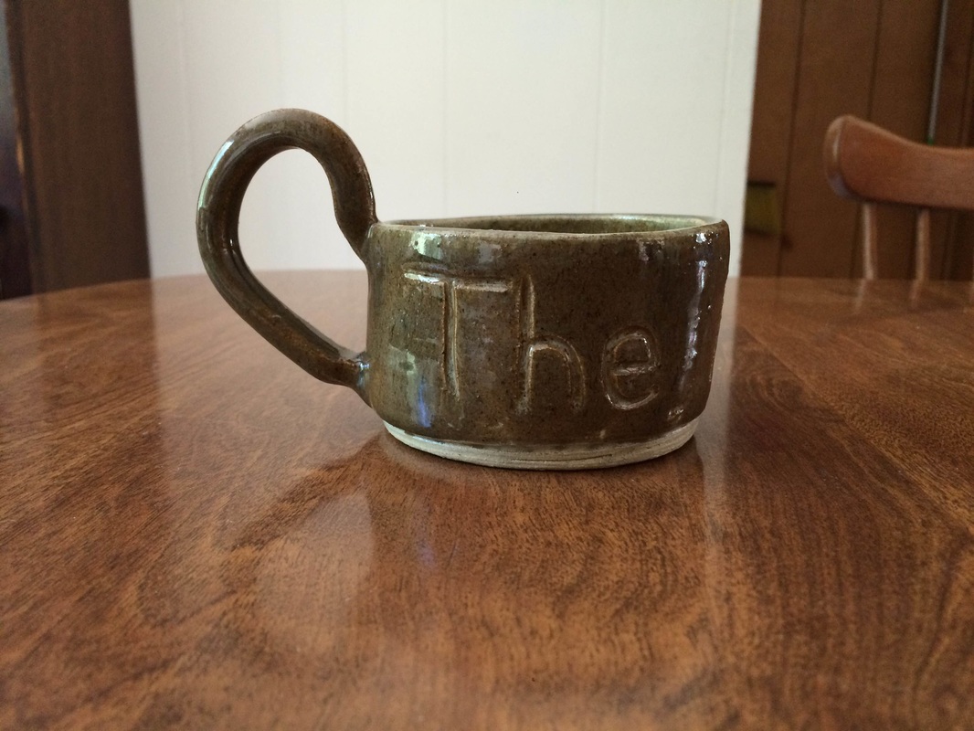 
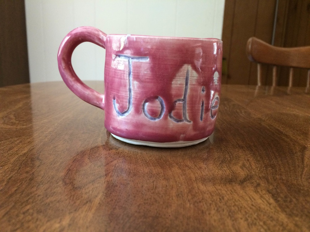   Thrown in vashon white, this is an extra credit plate. It is uniform in shape and has the same radius all the way around the plate, as well as a lip at the very edge. This project was glazed in low fire white and then had dreamscape green painted on in places, both on the flat and on the lip. To create this plate, I made sure to use the sponge to curl the edge so that the deepest part of the plate was in the center and not at the edge (to prevent things from falling off of it when it is used). Movement and color are present in this project, as the deepness of the green changes from place to place and looks like it is moving across the plate. Overall, this project reminds me of a cool day in the forest, with the light background and green trees. 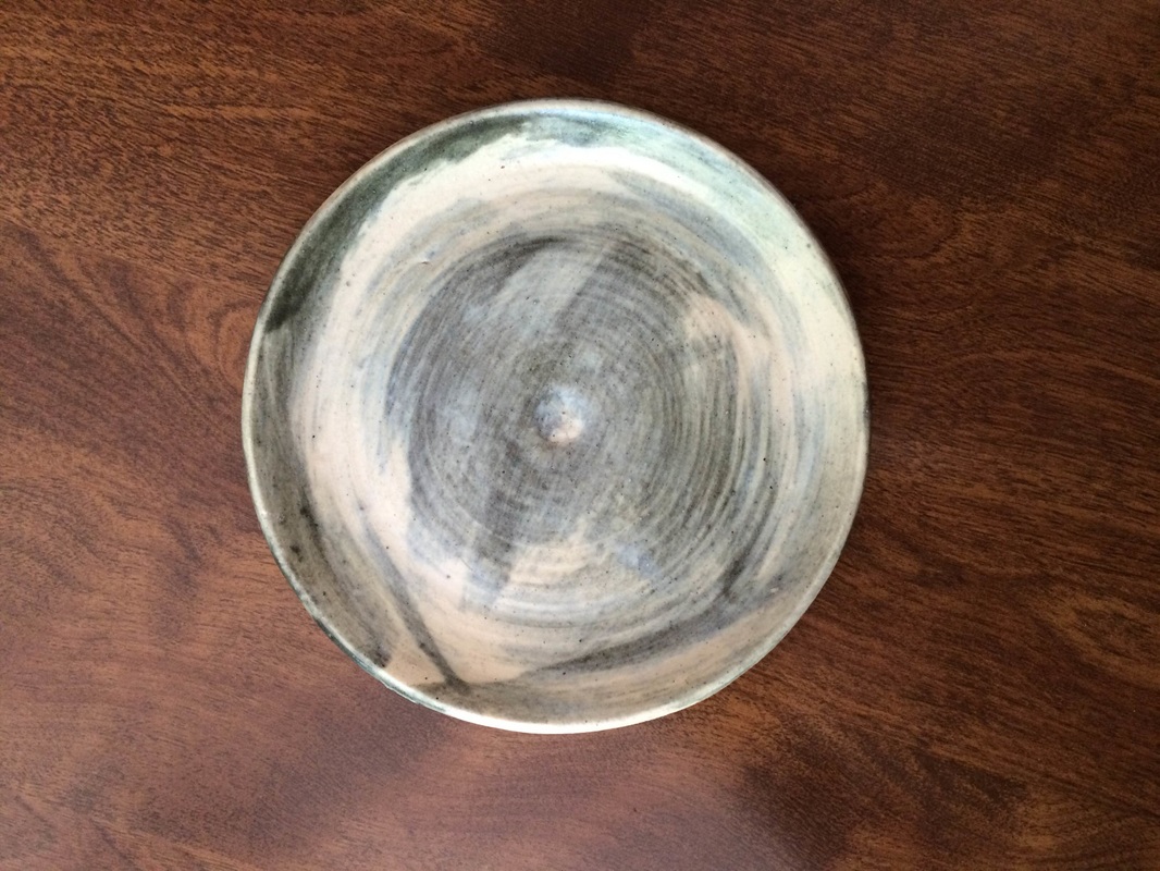 This is an extra credit cup thrown in porcelain that I made for my kickboxing instructor, Frankie (aka the Battlegoat). It is uniform in shape and has a handle attached to one side. I glazed it in white and then wiped off the glaze in spots, covering those places and around the letters in detail black. To make this cup, I used a new technique for pulling the handle. Instead of making a flat handle, I pulled it in a circular motion to make it round and nicer to hold on to. Value and texture are two characteristics of the cup, as the white and black are two different ends of a "value scale" and the throwing lines can be seen and felt through the glaze. Due to the fact that it is white and black, it provides an allusion to cows when a person looks at it. 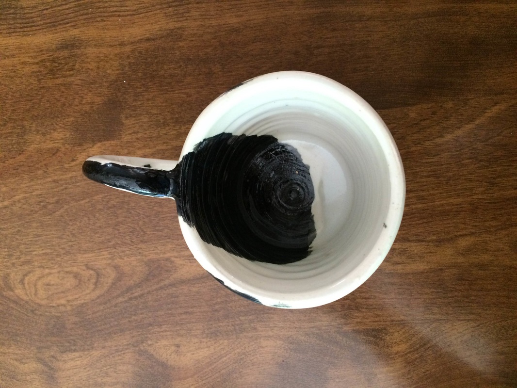 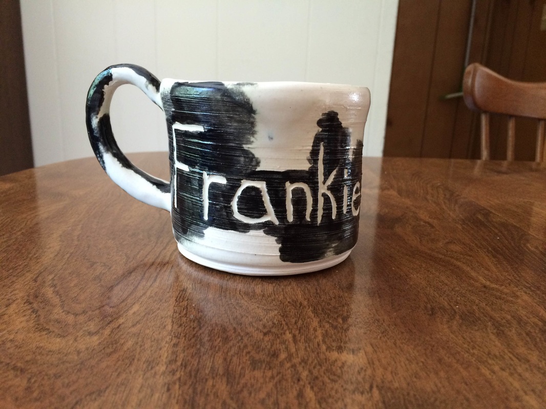 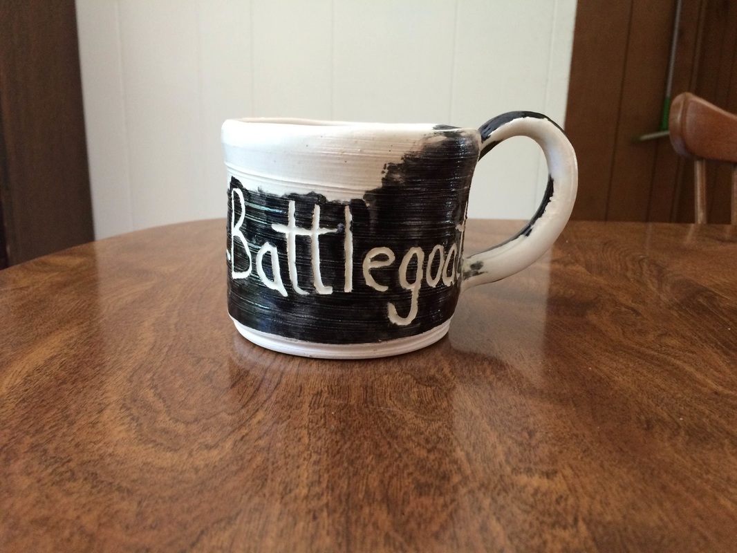 This is an extra credit vase thrown in porcelain. It starts fairly wide at the base, widens, and then decreases in radius until the lip, where it maintains the same radius and then widens again. I glazed it in multiple layers of white, deep blue, translucent sea, and another blue glaze; however, detail black was used on the inside. In order to create this project, I used the sponge to help create a flaring lip by pressing from the inside of the vase outwards at the very top. Color and proportion are two characteristics of this project, seeing as the glazes combined to create many different colors and the different radius sizes are proportional to the overall project. This vase gives off a happy, cold, waterfall - like effect. 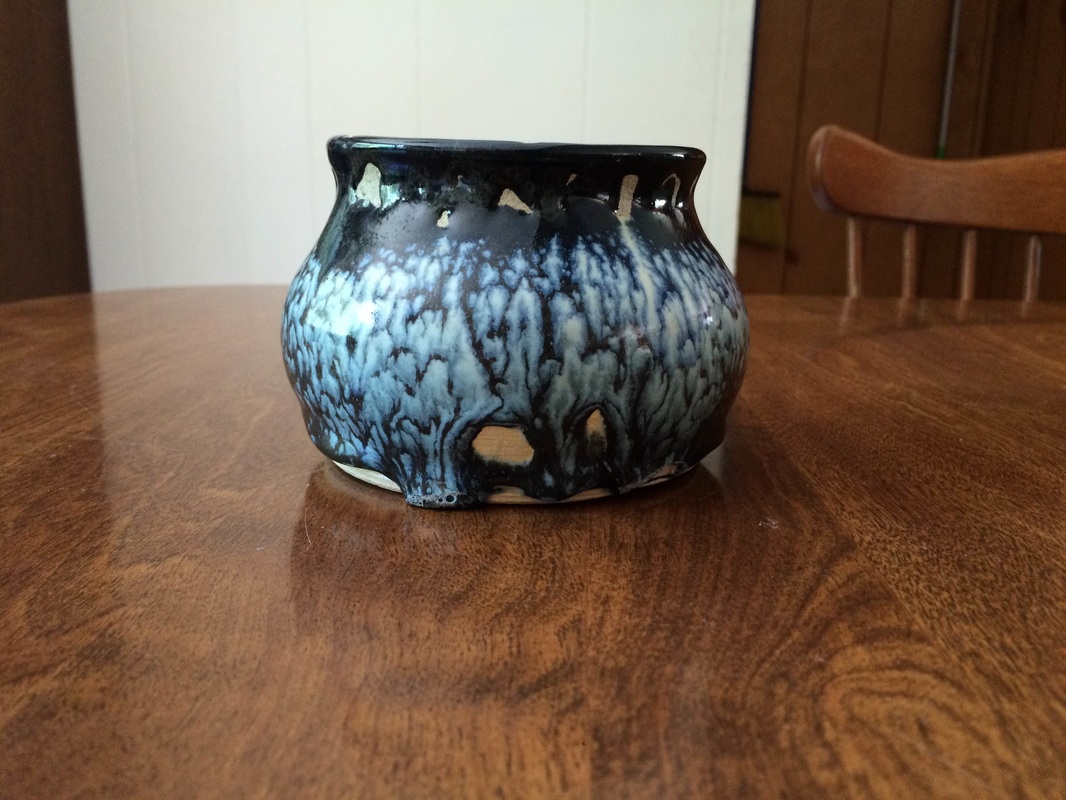 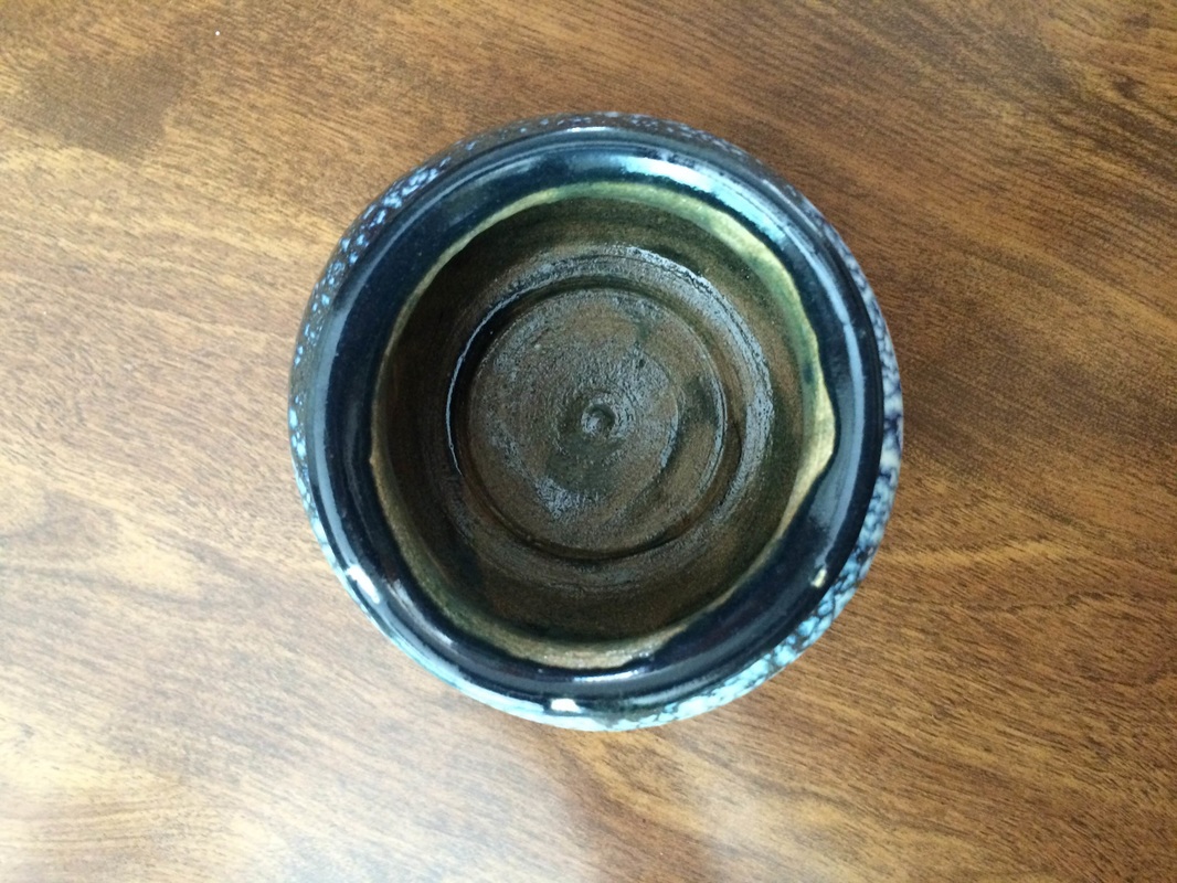
|
AuthorWrite something about yourself. No need to be fancy, just an overview. Archives
June 2015
Categories |
 RSS Feed
