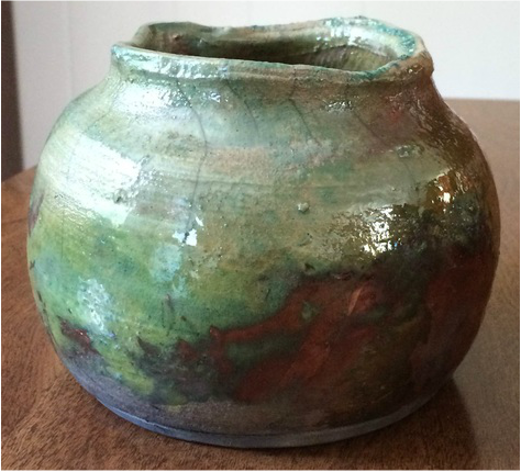
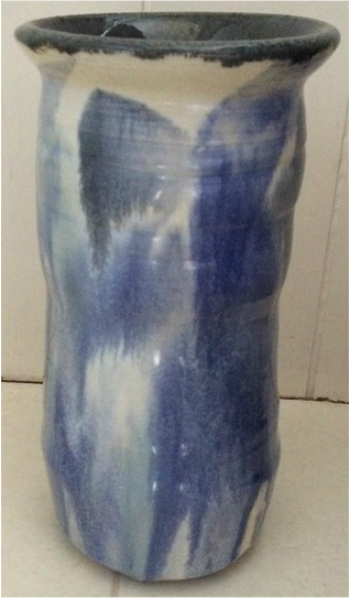
 This is an extra credit vase project. Overall, it is fairly uniform in shape, having an equally changing radius from top to bottom, until the lip. The lip of the vase was purposely left uneven after choking to give it a different effect. Instead of regularly glazing the vase, I put raku glaze on it and fired it raku-style. In order to fabricate this project, specifically the uneven lip, I did not trip the top after I finished choking the project to the shape of a vase. As I choked, the lip became wavy and uneven. This beautiful raku vase has emphasis and texture. The emphasis is on the shiny parts of the project where the raku really came through, and the texture is randomly bumpy and smooth, not consistent in any way. To me, this project gives off a happy, antique, rustic feeling.
0 Comments
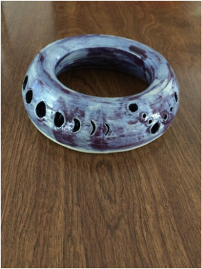
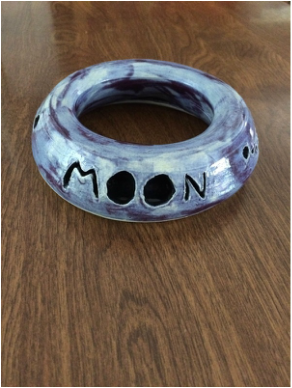
This is an extra credit vase that starts narrow at the base, widens out to its point of largest radius about 2/3 of the way up, quickly shrinks the radius, and then comes up and out to form a nice lip at the top. The vase is glazed in dreamscape green, with white sponged on the lip and up the bottom until about halfway up, which turned the glaze into a beautiful blue. I have always had trouble making vases, and this one turned out fairly well (even though it is small), so I was very proud of it. In order to make this vase successfully, I was very aware of how I was pulling the walls, in which direction I was applying more pressure, and how I was choking. In other projects, I had the wheel spinning too quickly and so the choking did not work out as well as I wanted it too, so I took it slow this time and got a nicely small hole at the top of the vase. This vase has color, seeing as the green fades into the blue, and proportion because the curves and changes in radius are proportionate to the rest of the vase. This vase, as a whole, gives off a happy, deep-forest feeling. 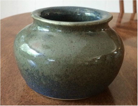 This is an extra credit project. I threw it as a cylinder, and then, once it was off, pulled out the top into a diamond shape with little lips at each of the four corners. Seeing as it was a diamond at the top, I glazed each of the four different "walls" with a different glaze, as well as overlapped between glazes to test out the new blue glazes, which turned out in beautiful colors. Unfortunately, however, I thought I was glazing the inside with black, but it turned out to be metallic brown. I think this project would look much better with a black interior rather than brown. In order to fabricate this project, I learned how to alter a project off the wheel without destroying its overall shape that was given to it on the wheel (by only pulling/moving the structure at certain points and not trying to adjust the entire structure at once). This project has value, seeing there is a contrast between all the different shades of blue, and harmony, due to the fact that the colors of the bowl flow together with each other and its circular/diamond shape. Overall, this project gives off a unique, interesting, candy-shop feeling.  This is my teapot, thrown in seamix, on the wheel. It is uniform and proportionate in shape, seeing as no single part of the teapot is too small or too big for the teapot as a whole. It has a hand-pulled handle on one side and a wheel-thrown spout on the other side, as well as a lid, which was also thrown on the wheel, on top. Carve/design marks are present on the lid and around the spout and handle to help add design as well as help secure the attached pieces to the teapot itself. I glazed the teapot with purple glaze by way of the spray-glazer, coating the purple more heavily on top of the teapot on the bottom to try to give it an ombre effect (but I first coated the teapot in white). The glaze did not turn out as well as I had hoped, probably because there was a little too much white present for the base coat so it ran more than I wanted. For creating this project, I learned how to throw a spout on the wheel, which is basically like throwing a small volcano down to the bat and then cutting it with the string tool at an angle so it can be attached to the base of the teapot. This project has harmony and color to it, seeing as there are many different shades of violet/blue present (due to the mixing of the white and purple glaze) and that the color, as well as the pieces of the teapot, all blend together to make it one project, not just a project with pieces attached. Given all these characteristics, the teapot gives off a calm, melancholy feeling. 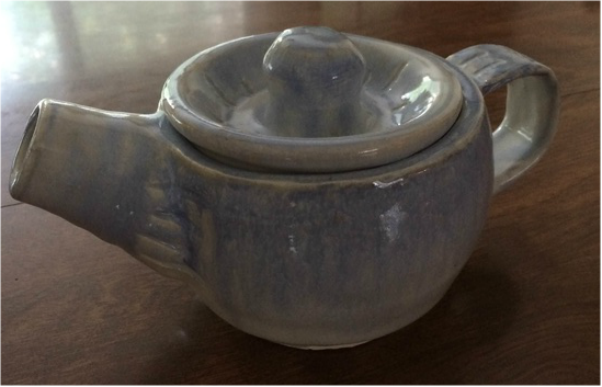 This is an extra credit project, hand-made with porcelain. Overall, it is heart-shaped and not totally proportional, which just helps make it unique. This project was mainly an experiment for working with porcelain off the wheel. I glazed it with purple, carved a heart on the inside and put Italian straw glaze on that part, and then used detail black for dots and to write the word "mom." In order to fabricate this project, I learned how to work with porcelain, seeing as it is very different from seamix and vashon white, and it is softer and much for flexible and floppy. It also dries faster and gets more cracks (or at least my project did). The heart bowl has color and contrast to it, seeing as the purple is dark and the Italian straw stands out brightly against it in the middle. Overall, it gives me a happy, hopeful, lighted feeling. 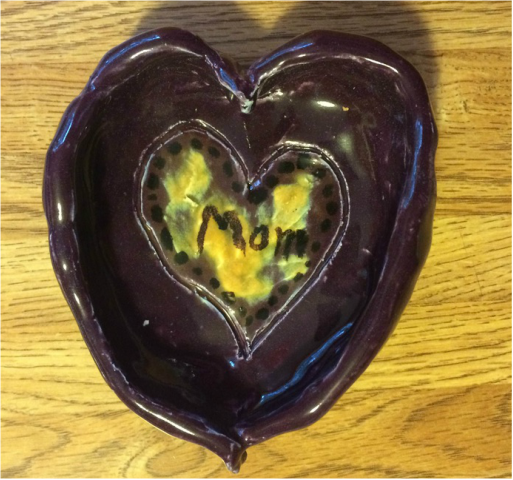 This is the double-walled project. I threw it in seamix, which I learned is harder to throw for double-walled projects than vashon white because it is softer. The bottom side of the project is larger in radius than the top part of the project, and it has carvings in its sides. There is a triangle design made of circles, the moon cycle, and the word “moon” carved into the sides. It is smooth and there are no edges to the double-walled project. I glazed it in the pink glaze, which turned out violet, pink, and purple. In order to create this project, I learned how to pull two walls and then connect them up top by pinching and then smoothing on the wheel, as well as how to carve designs into a project. There is space and harmony present in this project, seeing as there are carvings and the different shades of pink and purple that bring it all together. Overall, this project gives me a feeling of serenity, curiosity, and happiness.
This small cylinder was an experimental project, thrown on the wheel in seamix. It is short and has a curve to it, peaking in the middle of the height and then getting smaller in radius from the middle of the cup to the top. For glazing, I dipped it in grey/blue mottled and then splashed italian straw, blue, and white onto the sides and on the inside. To create this small cylinder, I used choking to help give it the nice, even curve all the way around the project from bottom to top. Color and movement are two elements present in this project, seeing as the splatters seem to move across and down the cup. Overall, this project gives off a dark, eerie feeling. 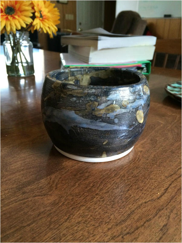 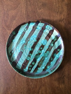 This is an extra credit plate thrown on the wheel in seamix. It is uniform, seeing as the radius is consistent all the way around the plate. I glazed this project in shadow green, striped it with metallic brown, and then dripped white glaze on top of those two layers. In order to create this plate, I used the stick tool underneath the plate to keep it from suctioning to the bat so that only a small portion of the center would actually sit on the surface. This plate has value and color, seeing as it consists of lines, drips, and circles, all of different colors. It has an odd, blurry feeling to it.
This is the Frankenpot group project on the wheel. This project is made out of seamix, and Kyley Hayes, Natalie Gunn, and I were on a team. Personally, I threw the base, which started out with a smaller radius at the bottom and then got slightly wider as it went to the top. As a whole, the vase is fairly straight, with some deviation from bottom to top, until you reach the top, where the lip flares out horizontally. The inside of the frankenpot was glazed with gray-blue molted while the outside was glazed with low-fire white and then had gray-blue molted, dark blue, and translucent sea (a combination of blues) painted on top. In order to fabricate this project, I used just my fingers to pull the base instead of a sponge and my fingers to control the thickness of the base as well as its shape better. This project has movement and color, seeing as the colors blend together well and seem to be moving down the vase. Overall, this project gives me a sense of calmness and reminds me of a bright day at the ocean.
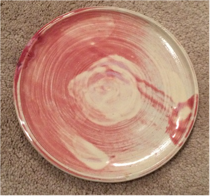
These two plates make up my two-plates project. Both plates are uniform, seeing as each radius, respective to its plate, is consistent all the way around the plate. The plate on the left is slightly smaller than the plate on the right. Both plates are glazed in pink and white, but the white glaze on the right plate came out better than the white glaze on the left plate did. In order to create these plates, I learned to pull out and across rather than straight up. However, I also learned how to pull up at the edge of the plate to create a lip so that the plate has some shape to it, not just laying flat. The plate on the left has color and proportion while the plate on the right has value and movement. Together, however, they give off a happy, calm, soft mood.
|
AuthorWrite something about yourself. No need to be fancy, just an overview. Archives
June 2015
Categories |
 RSS Feed
